Visualizing recidivism rates in female former inmates
13 Jul 2015Mulling over incarceration rates among females prompts some interesting questions. Over time, how many released female convicts relapse into their former behavior? How do such rates compare against their male counterparts? Are younger females more prone to relapse than older ones? And so on. Scores of papers have been published over the past few years and with more or less the same conclusions. Happily, The Bureau of Justice Statistics has some really fine data analysis tools enabling exploration of such data. Though a tad dated (this data comes from 1994) and only expressed in percentages (understandably so), there some very good insights that can be derived from this data.
The following are the packages used while plotting the data.
library(ggplot2)
library(reshape2)
library(RColorBrewer)
library(gridExtra)
Next I import the data that the BJS site provides as a downloadable file. This tool provides data on five variables describing recidivist behavior in 3 years following the release of female prisoners in the US in 1994. The tool combines data obtained from across 15 state prisons making it fairly comprehensive.
The first dataset reports cumulative data as measured monthly, over 3 years.
rec_female_c = read.csv("recidivism_all_female_cumulative.csv",header=TRUE)rec_female2_c <- melt(rec_female_c, id.vars=1:1)
rec_female3_c<-rec_female2_c[rec_female2_c$Months %% 3==0,]
p1<-ggplot(rec_female3_c, aes(x = factor(Months), y=value, fill = variable)) +
geom_bar(width = 1, color="dark grey", stat="identity") + scale_fill_manual(values = rev(brewer.pal(5, "OrRd")))+ guides(fill=FALSE)+xlab("Time (in months)")+ylab("Value (Cumulative, in %)")In the next dataset, I retrieve monthly percentages from the prior cumulative data, in order to express reconviction rates by month.
rec_female = read.csv("recidivism_all_female.csv",header=TRUE)rec_female2 <- melt(rec_female, id.vars=1:1)
rec_female3<-rec_female2[rec_female2$Months %% 3==0,]
p2<-ggplot(rec_female3, aes(x = factor(Months), y=value, fill = variable)) +
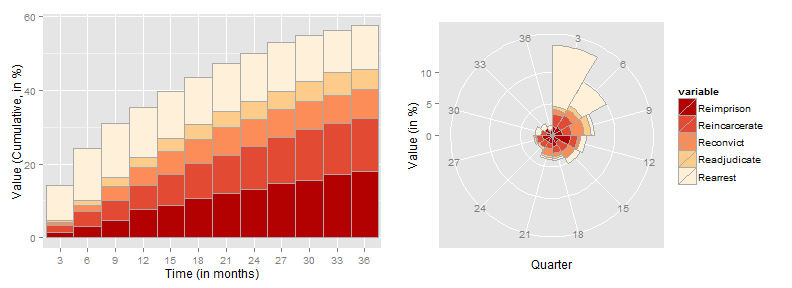
geom_bar(width = 1, color="dark grey", stat="identity") + scale_fill_manual(values = rev(brewer.pal(5, "OrRd")))+coord_polar()+xlab("Quarter")+ylab("Value (in %)")The first graph represents cumulative percentages of female former inmates relapsing into repeat-offender behavior over time. As can be seen,
- By the end of the first year, around 35% of the former inmates (female) have been re-arrested. This number rises to ~57% by the end of three years.
- 18% of the rearrests eventually lead to reimprisonment by the end of the third year.
- The rearrest numbers rise rapidly in the first 15 months, gradually tapering down by the third year.
The second graph is better suited to understanding quarterly recidivism volumes. As is clear from the graph most relapses occur right at the beginning and gradually peter out over time.
grid.arrange(p1,p2, nrow=1)## Warning in loop_apply(n, do.ply): Stacking not well defined when ymin != 0
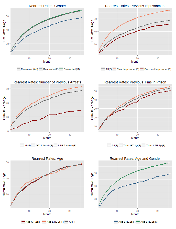
Furthermore, instructive insights arise when the data is sliced by different variables. The following graphs do just that - The cumulative re-arrest rates for different cohorts are compared against rearrest rates for the overall group.
g1<-ggplot(rec_female_allvar, aes(Months)) +
  geom_line(aes(y = Rearrest_All_Male,colour="Rearrested(M)"),size=0.75) +
  geom_line(aes(y = Rearrest_All_Female,colour="Rearrested(F)"),  size=0.75) +
  geom_line(aes(y = Rearrest_all,colour="Rearrested(All)"),  size=0.75) +
  scale_colour_manual(name='', values=c('Rearrested(M)'='seagreen', 'Rearrested(F)'='steelblue4', 'Rearrested(All)'='gray40')) +
  theme(legend.position="bottom")+
  coord_cartesian(xlim=c(1,37))+
  xlab("Month") + ylab("Cumulative %age")
It is clear right away that:
Graph 1: The rearrest rates are higher among men(68.5% in 3 months) as compared to women(57.7% in 3 months). Also note that the overall rearrest rates are highly skewed towards the male population indicating that the number of male inmates are far higher than the number of female inmates.
Graph 2: Previously imprisoned females are far more likely to get rearrested as compared to women who haven't been imprisoned before.
Graph 3: In the same vein, female former inmates with less than or equal to 2 previous arrests are far less likely to be rearrested, as against women arrested more than twice in the past. The contrast is especially stark here as by the end of the third year, 63.2% of women with more than 2 arrest records had been rearrested and only 29.9% of the other group had been rearrested.
Graph 4: Women who have previously spent less than a year in prison are marginally more likely to get rearrested, compared to women who have previously spent more than a year in prison.
Graph 5: Age doesn't appear to be much of a differentiator as can be seen in the graph where the cumulative rearrest rates for the groups below 25 years and above 25 years are almost in consonance.
Graph 6: Again unsurprisingly, males below 25 years(75.7% in 3 years) are more likely to get rearrested compared to females below 25 years of age(59.1% in 3 years).
grid.arrange(g1,g2,g3,g4,g5,g6,ncol=2)
None of the interpretations are very surprising or counter-intuitive, except that I had presumed there would be somewhat more differentiation based on age. However, it does demonstrate the marked differences in recidivism due to factors such as gender, previous arrests, etc.
Resources:
1. The Bureau of Justice Statistics
2. The BJS Prisoner Recidivism Tool